
Redfin is a residential app for home buyers and sellers. Because I am interested in the trend of economy and house prices, I like to use it to check the house prices around me. As a user who often uses this app, I think there are still some things that can be improved. This project took about three months. This redesign is aimed to overhaul the usability and functionality to make it reasonable, adjust the visual and interactive design for a more clear and tidy style, and optimize the features to provide users an attractive community.
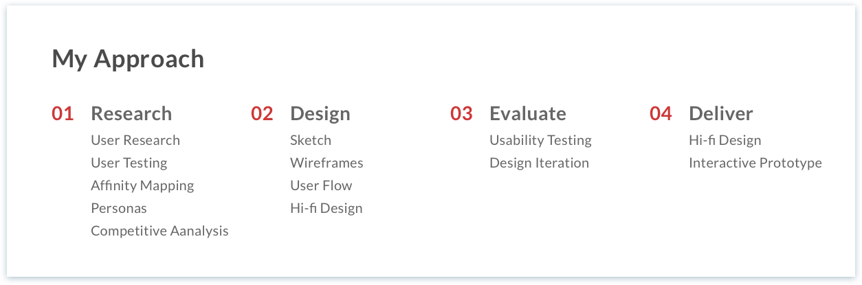
Going through the whole process from starting an initial redesign idea to finishing the final interactive prototype helps me learn how to analyze and evaluate an app, identify design problems and possible solutions. Find the true needs and pain points of users from user interviews, so as to better improve the user experience of using this app.
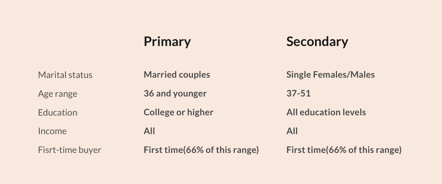
In order to better analyze the pain points and true needs of redfin users, first, I need to know who they are. I did a user analysis to understand their age, gender, income and some details.
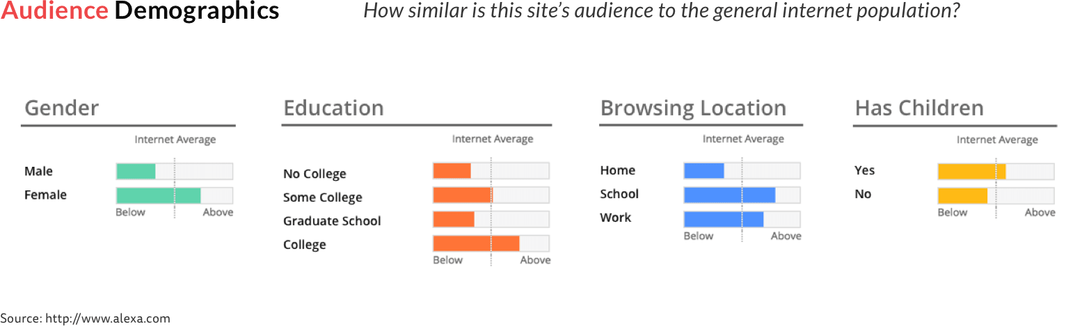
This data from Alexa.com tells us some general statistics, to better understand what kind of users buyers are, I did more research to show the home buyers information.
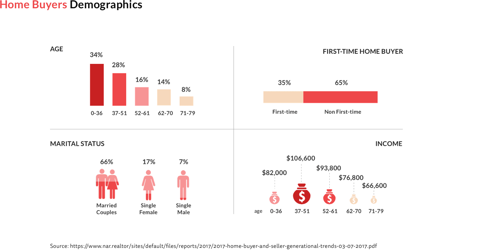
At 34 percent, buyers 36 years or younger are the largest generational group of home buyers with a median of 31 years old. Home buyers between the ages of 37 and 51 were reported to have the highest household incomes among any other generation at $106,600, followed by buyers between 51 and 60 that had an income at $93,800. Married couples comprised the majority of household compositions; followed by single females, single males, and unmarried couples. First-time buyers made up 35 percent of all home buyers. Most of these buyers were 36 years and younger, followed by buyers 37 to 51 years.
Based on the user demographic research and home buyer analysis, it’s not difficult to list out primary and secondary target audience of Redfin.
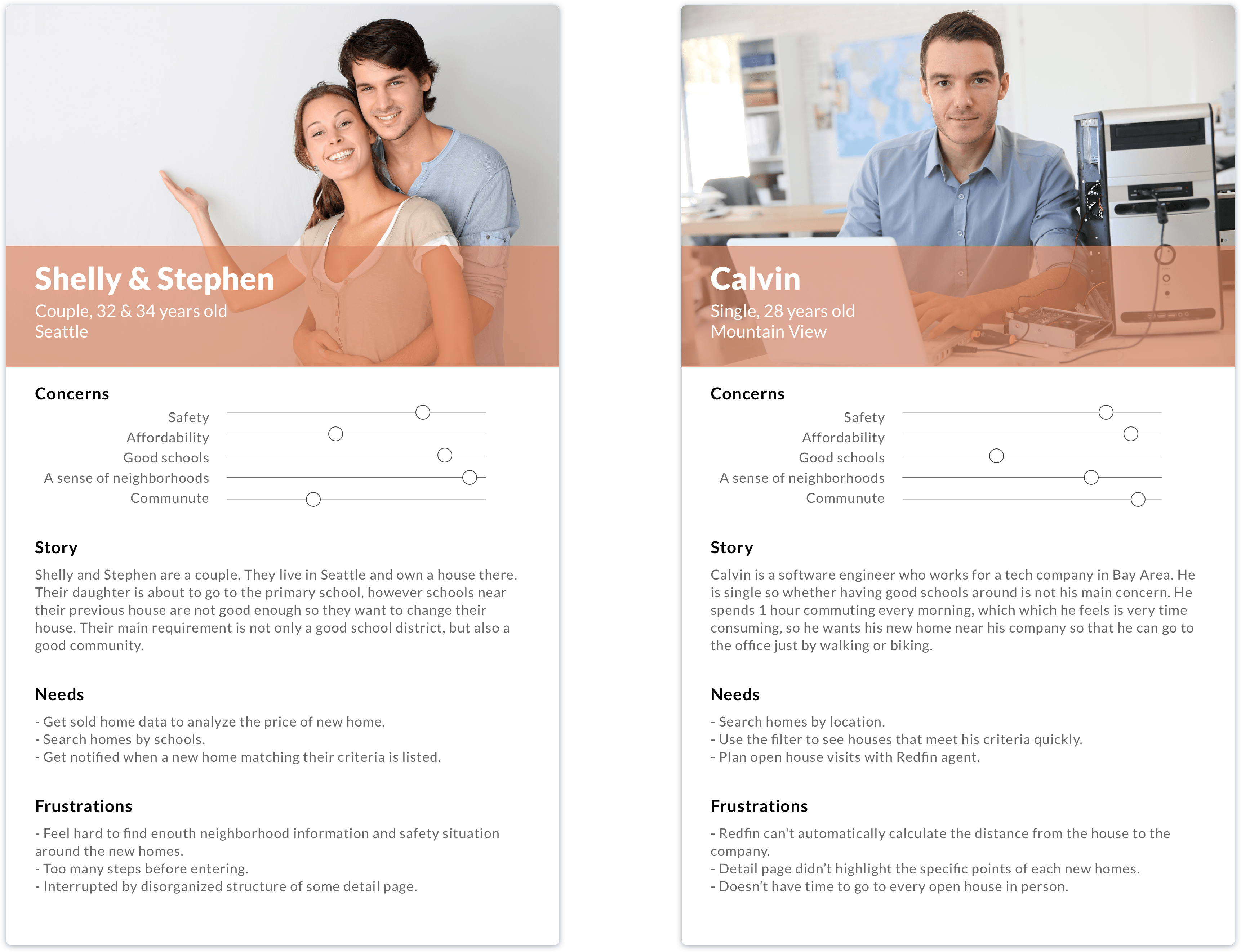
To better understand users' goals and pain points when using Redfin, I created two personas through their background stories and different needs.
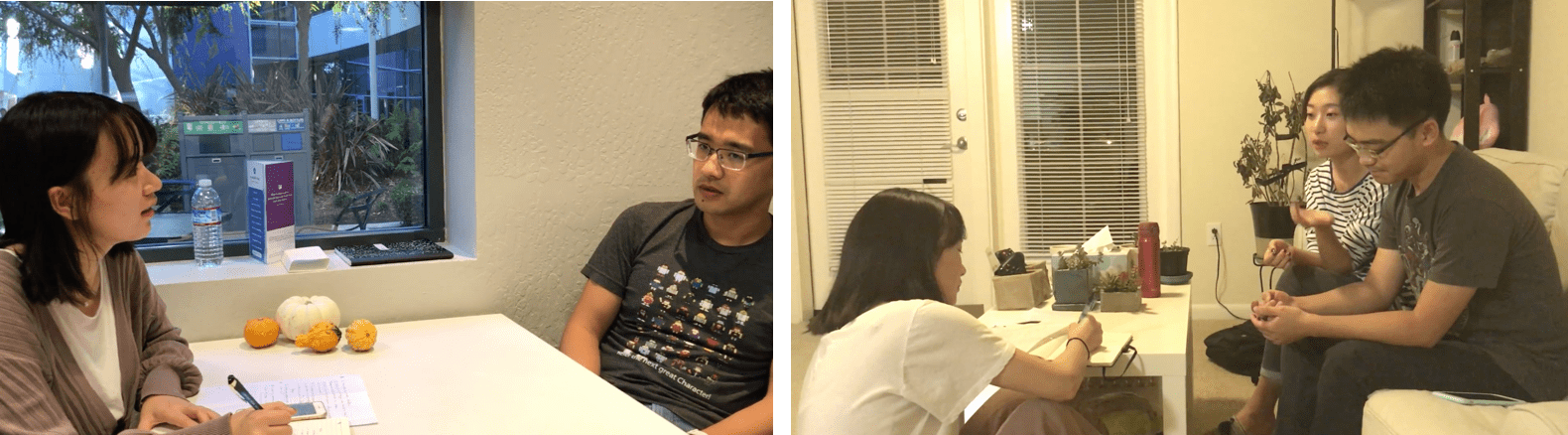
I conducted user testing by letting the participants complete 3 tasks in this app and interviewed them with some questions. The participants were all users of Redfin. They either used redfin or were using it to find new homes.
My interview questions are based on:
1. How their overall impression of Redfin?
2. How they define a “Good House”?
3. The experience of buying a house.
Through the user's responses, I sorted the top 3 concerns when they are buying a new home were: "location", "price" and "neighborhoods" (including schools, supermarkets, parks, etc.). Besides, the agency introduces that apart from these three aspects, users also attach great importance to the "interior decoration" and "house structure". For users who already have one or more apartments, the "appreciation" is one of their top priorities. Users generally believe that redfin has accurate housing information, but there are still some minor problems that can be improved:
1. There are too much information in the house detail page, which makes the page too long and a little clutter. Users also feel difficult to find a way to record the characteristics of each house.
2. Users feel frustrated with the inadequate amenity information around the new homes.
3. Users need more neighborhood reviewsfrom other people who really know this area.
4. It's really inconvinient for them to manually calculate commuting distance everytime by themselves.
5. There is no incentive for users to reopen Redfin after they've bought their homes.
Based on my interview, I distilled the most critical insights, pain points and narrow down to 3 tangible problems I might need to tackle.
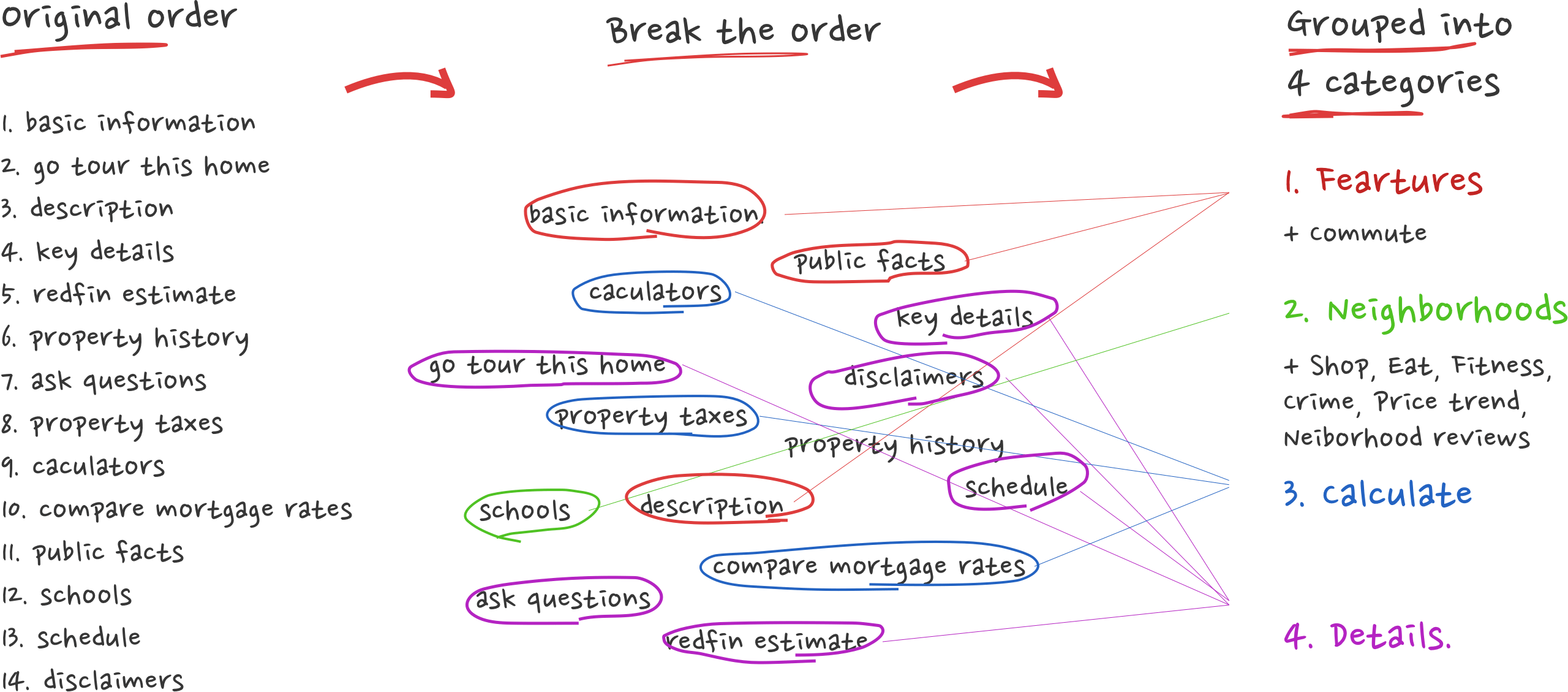
1. Restructure the house detail page
3. Provide SUFFICIENT neighborhood information
2. Brand new "Discover" page
As I moved on to the interface of Redfin, I tried to wireframe all the UI screens and conducted an initial user testing. As for why to draw all the screens, because I want to show participants the complete task flow when I do user testing, I don't want users to feel distracted by missing screens that affect the test results.
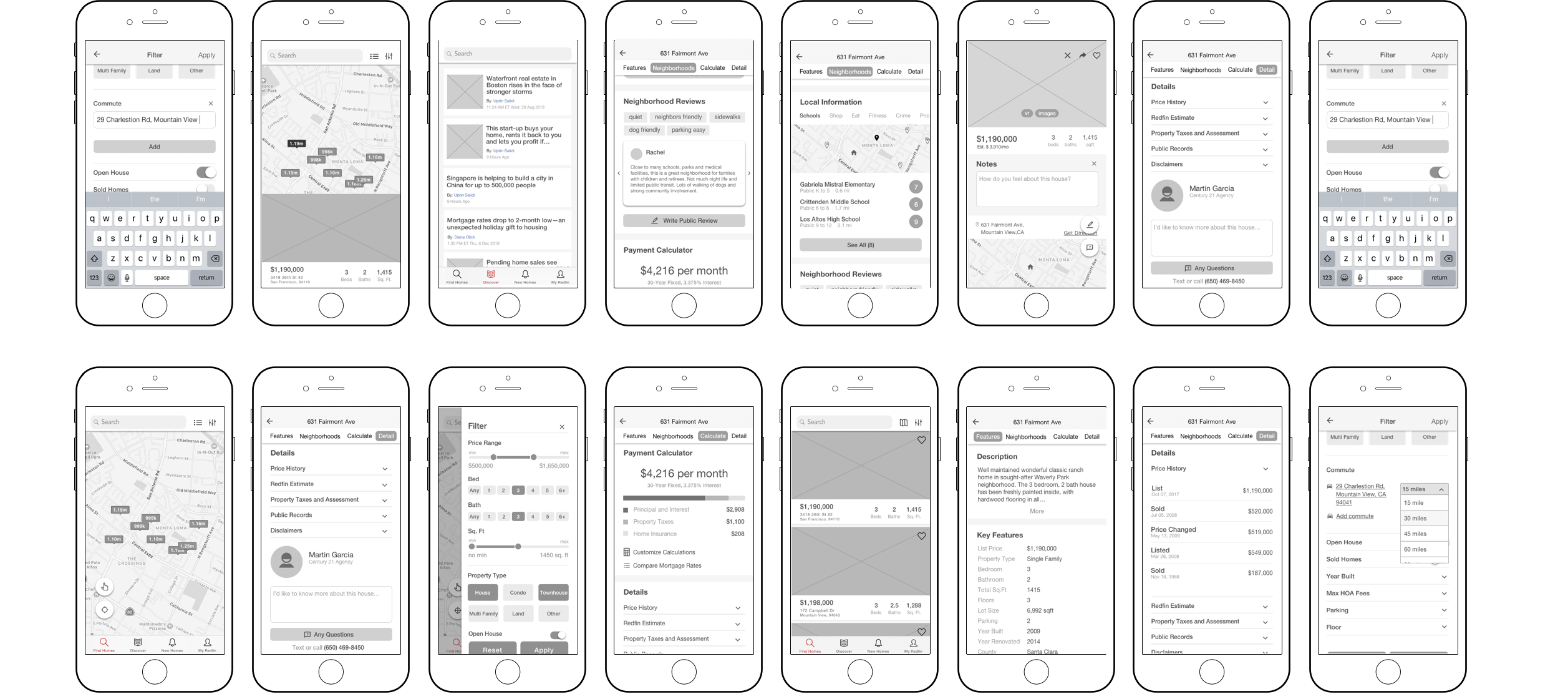
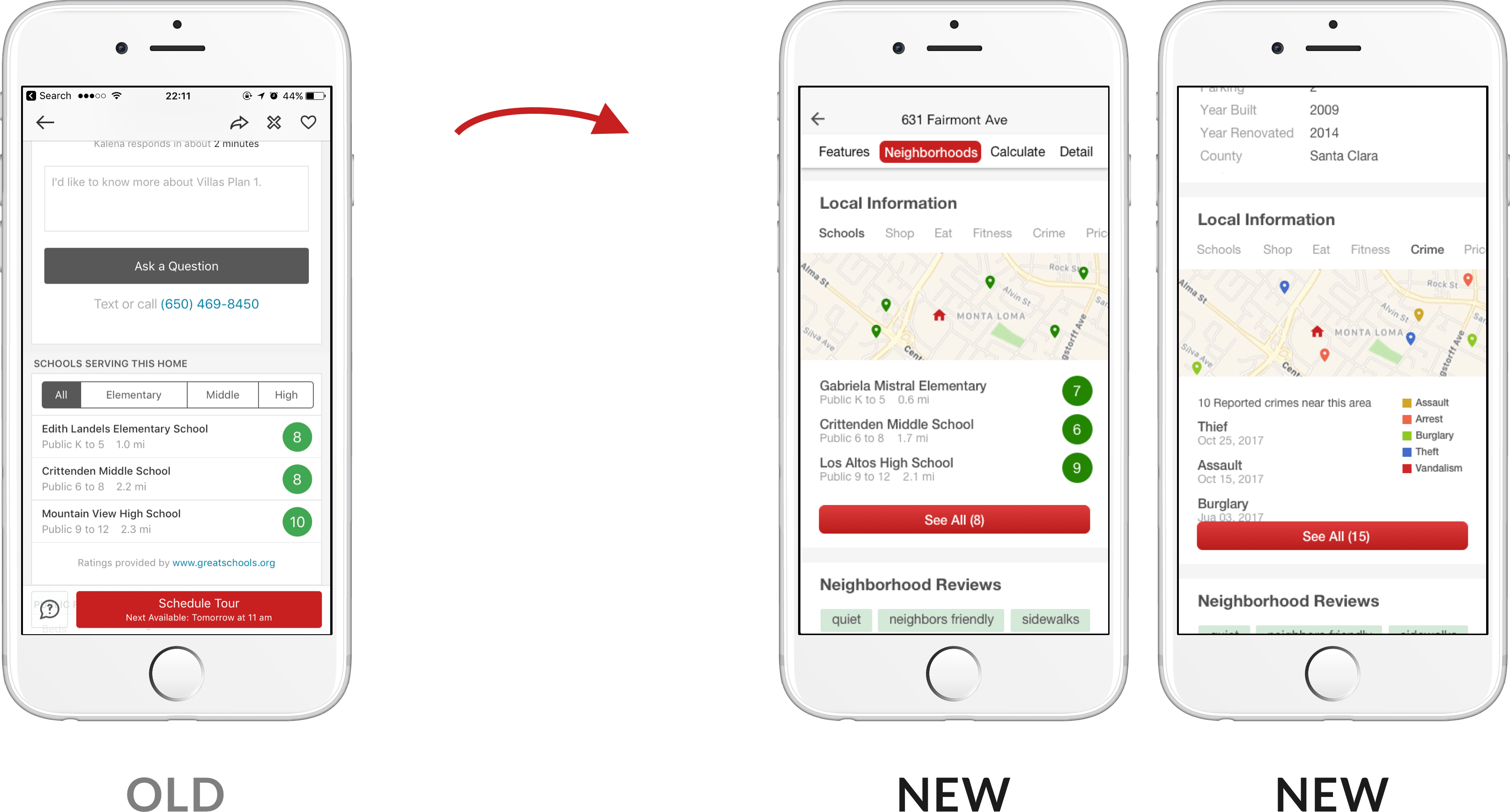
In order to better display the information on this page, I divided the content into four categories: features, neighborhood, calculator and details, and use navigation bar to show users where they are browsing. The accordion function reduces the length of the page and makes information well-organized.

More community information has been added to satisfy users' desire for a more comprehensive understanding of the surrounding environment of the house. I also added comments from other neighbors living in this area, users can express their thinking. In addition, users can easily record their thoughts on each house so as not to forget the features of each house after looking at other houses.
More community information has been added to satisfy users' desire for a more comprehensive understanding of the surrounding environment of the house. I also added comments from other neighbors living in this area, users can express their thinking. In addition, users can easily record their thoughts on each house so as not to forget the features of each house after looking at other houses.
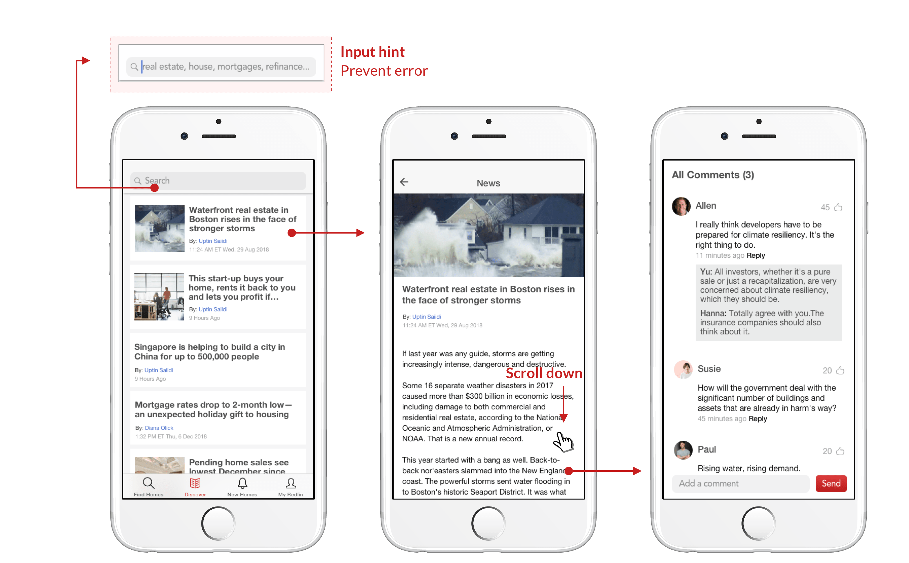
To help users learn more about news and information related to real estate, I added a brand new section "discover" to show users the trend of house prices, real estate, real estate tax and other topics they care about, and set up a comment area, users can chat with other users about their views on this.
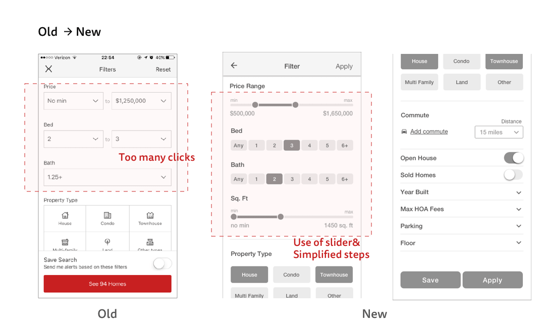
I tried to change the design of the filter interface because too many operations frustrated users and could not make the information clear at a glance.
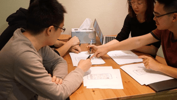
To validate what I have done, I invite my friends to help me test my design, because I did not do any changes for the color scheme, so I just tested them with the grayscale prototype to test the reasonability of user flow and screen layout. In the test process, all the participants are encouraged to “THINK OUT LOUD” to give me their true feedbacks.
Able to complete user tasks.
Able to use filter function.
Feel easy to use take notes function.
Able to check the crime report of the neighborhood.
Feel good about the accordion usage of the detail page.
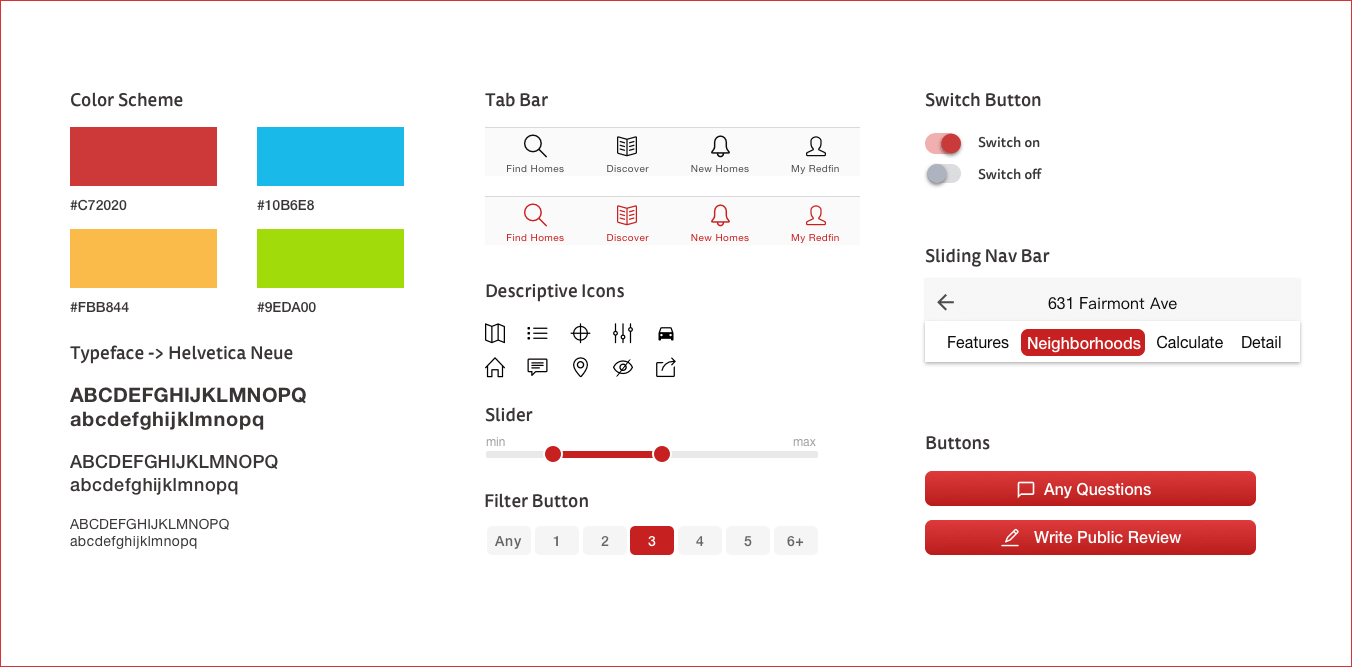
I didn't change much of Redfin's original color because the red is very unique and obviously different from other similar apps on the market. So I still keep it red but added fresh green and yellow, more blank areas would make the app looks less crowded and cluttered.
Projects: All / WeWatch / OPRO / Redfin Redesign / Crelax / EN Rebrand / If